Comparing Year-over-Year – Tips & Tricks

Analytics illuminates patterns and behaviors not just by showing information, but by providing context. There are a lot of ways that you can reformat your reports to provide additional context, and in this post we’re going to take a deep look at Year-over-Year reporting.

Year-over-year reporting tries to help you place the current trends in context of trends in previous years. For example, if you’re seeing a spike in incidents, is this a seasonal spike, or specific to this year? Are you on track to have a better or worse year than last year for your KPIs?
Continue reading

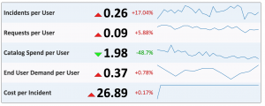
How to report on a “per user” basis

Screenshot 2015-11-16 17.08.53

One of the most common indicators IT use to understand workload and issues in the environment is by looking at task volumes — for example, new incidents opened by month, or new change requests by location by quarter.

The question you’re trying to answer is “Is the amount of work my organization needs to complete going up or going down?” This can help plan for future staffing or understand issues as they arrive.

However, one weakness of these kind of reports is that it can be difficult to separate the information from background noise. For example, when the number of incidents goes up, is this because of issues in the environment? Or has the organization grown in such a way that you would expect more issues?

With Explore Analytics‘ powerful mash-up and calculation capabilities, you can easily account the size of the user population to shed better understanding on your volumes. The following guide will show an example with ServiceNow on how to generate an Incidents per User report.

Continue reading