Charts are meant to be interactive

You probably don’t need convincing that interactive charts are far superior to static ones. There are many ways of making charts interactive by allowing the viewer to drill down to the next level of summary, drill-through to details, or simply allowing users to change properties of the chart such as zoom level or scale.

In this short article, I’d like to show you another nifty (simple yet powerful) interaction. This one is designed to let the user choose between focusing on a calculated metric or seeing how the calculation was made. We’ll show it by example.

Consider data about last year’s budget for some fictitious company. Since it’s last year’s, we also have the actual spending and we can analyze the difference between the amount budgeted and the actual amount spent for each account. The data that we have includes the account name (e.g., “Marketing & advertising”), the type (“Budget” or “Actual”) and the amount.

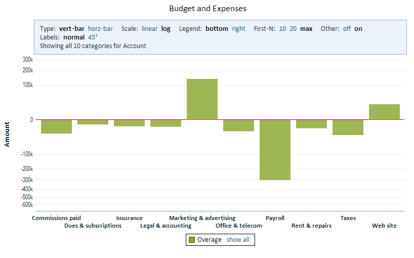
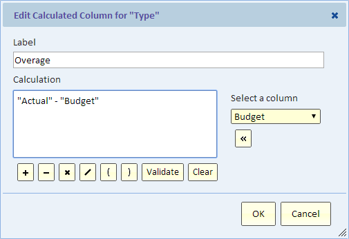
In the process of creating the chart, we define a calculated column called “Overage” that’s simply calculated as “Actual” minus “Budget”.

A positive “Overage” means that we went over budget, and a negative one means that we were under budget.
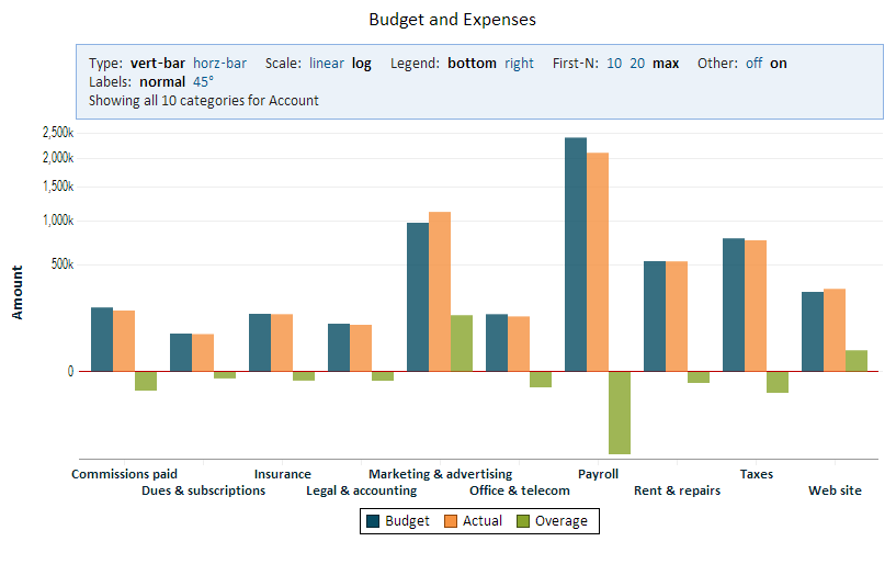
This chart shows all three “types”: Budget, Actual, and Overage.

This is nice because we can see all the information, but it’s a bit busy and it’s hard to see the overage where it’s small. The solution is elegant, just click on the legend and select what you want to see:

The result of keeping only “Overage” is this:

To try this yourself, click on the above chart to go to the interactive chart.

In Explore Analytics, the legend selection functionality is always available for category and timeline charts, so you can try it today with your own charts.
US Treasury Historical Yield Curve 1990 – 2013

The yield curve is a useful tool in forecasting near-term economic conditions. For example, the US Treasury yield curve is a chart with the yield (interest rate) on the Y axis and the term of the Treasury bond, from 30 days up to 30 years, on the X axis.

The yield curve on November 15, 2013, looked like this:

This curve increases from a very low rate for short-term bonds to significantly higher rates for longer-term maturities. This would be considered a normal or even steep curve that may signal quick economic improvement in the future.

The yield curve is not always shaped as it is today. It could become flat with short-term rates near long-term rates and even inverted, when some short term rates are higher than the longer-term rates. Such curves may signal uncertainty in the economy.

To see how the yield curve changed historically, consider the following chart. The chart is actually not showing the yield curve, but instead is showing a line for every bond duration, from 3-months to 30 years. It shows data for the last 23 years.

Here’s how to look at this chart:

  • The red line represents the yield on the 30-year bond. In a normal yield curve, this duration should have the highest rate and indeed you can see that most (but not all) of the time, it’s on top.
  • The unusual straight line in the 30-year bond from February 2002 to February 2006 is due to the fact that the US discontinued this bond and then reintroduced it.
  • It’s easy to see periods in which short-term and long-term rates bunch together and even invert, with lines representing short-term rates crossing over the lines representing long-term rates. It’s no surprise that they correspond, for example, with the stock market downturn in 2002 and the stock market crash in 2008-2009.

I invite you to explore this interactive chart by zooming in and scrolling through the timeline.

Data is from the U.S. Department of the Treasury.

About Explore Analytics

The charts in this article were created using Explore Analytics, a cloud-based self-service data analysis and visualization tool for individuals and teams.