We often describe charts by their shapes: bar, pie, line, bubble, candlestick and donut, to name a few. Perhaps a more useful way of thinking about visualization is based on the type of data and the type of visualization that would help us understand it. For example, a histogram helps us understand the distribution of data. A scatter plot helps us see correlation between two variables in the data.
In this article, I’d like to draw attention to a new type of chart that specializes in temporal data—the interactive Timeline Chart.
Time is a key attribute of almost all the data that people collect. We track things over time to understand how they change and discover trends. We look at climate change, demographic shifts, and even people moods to see how they change over time. In business we track key performance indicators such as market share, revenue, profits and customer satisfaction to understand trends and extrapolate into the future.
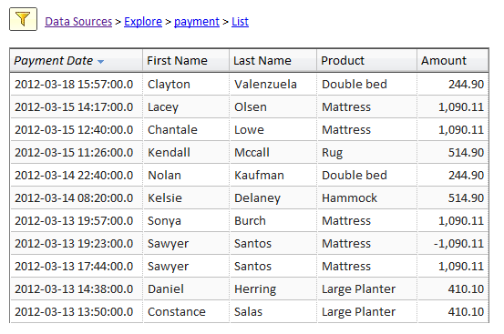
For example, in the picture below we see some payment data. Presented this way it’s difficult to see trends. Fortunately, we have a date field and we can readily create a timeline chart as we’ll see later on.
Of course charts that have the time in the X axis are not new. What’s new is the interactivity of the timeline chart that brings visualizations such as line, bar, and area and centers them on an interactive timeline.
The Timeline chart builds on the ideas first seen in stock charts. Google and others provide interactive stock charts that make it easy to scroll through time, zoom in on a particular time range, and see trends. There’s no reason that this should be limited to stock prices and trading volumes. The Timeline chart extends this concept to any type of data to graph the data along time, zoom in and scroll, add moving average and trend line, switch between lines, bars, area, or combination presentation.
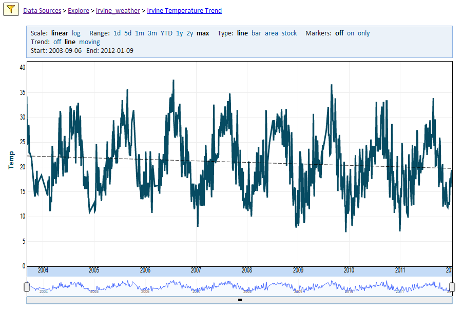
Let’s see two Timeline examples. In the first example we show daily temperature data over a period of 9 years. You can zoom in on a particular week, month, or season, or zoom out to see the trend over the entire 9-year period. In our example, you can see that temperatures were trending down in the period by as much as 2 degrees Celsius.
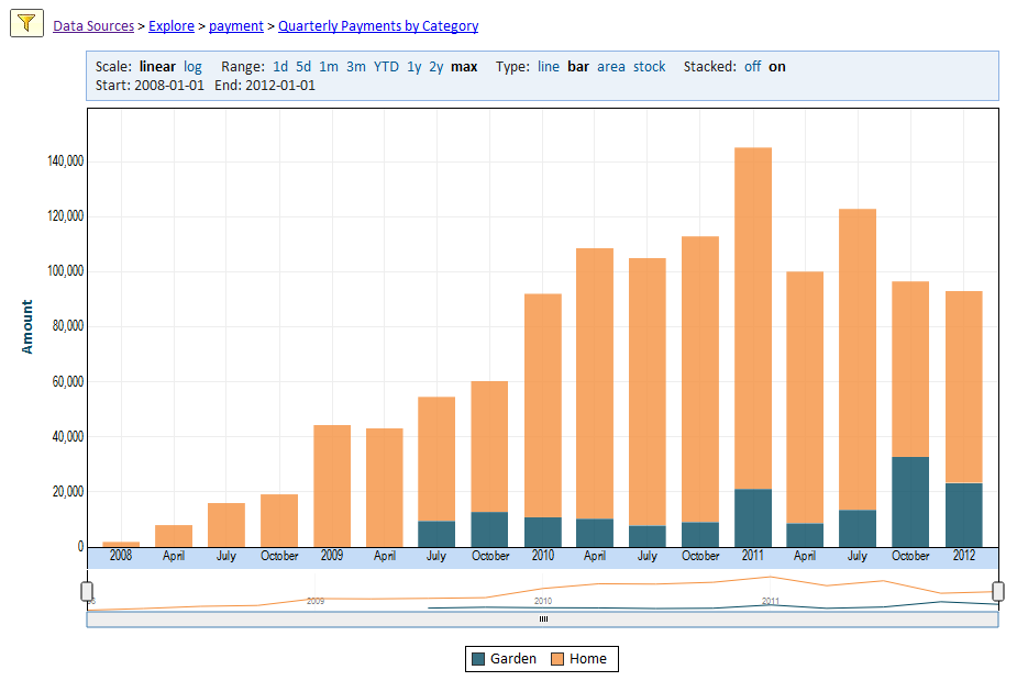
In the next example, we show quarterly sales over time by product category. It’s easy to see that we added a new product category in 2009 and that category accounts for an increasing share of revenue.
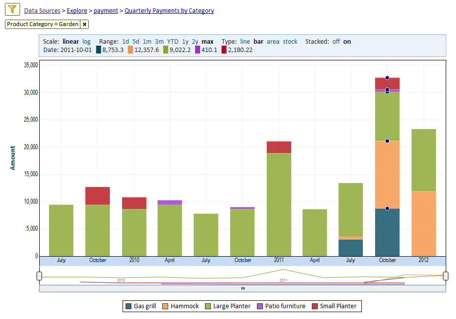
We can focus on the Garden products by adding a filter to only show Garden products, and then breaking it down by product name.
With the added interactivity, data visualization breaks the mold of traditional classification of charts by their shapes and instead focuses on the data and the appropriate visualization for it. There’s no better example for this new approach than the timeline chart.


