Show Me Nothing!
Some relationships can be tough.
Most of the time, when you’re running a report on relational data, you’re trying to see what relationships exist, and with Explore Analytics, that’s fairly easy to do.
What can be more difficult, however, is showing relationships that aren’t there. Because there is no relationship, there’s no data that exists.
Let’s take a specific example: you want to create a view that shows users with no assigned assets.
Fear not! With Explore Analytics, we can create a report that can show you where there is nothing.
What we’re going to do is:
- Create a pivot of assets grouped by users – this provides the mapping of assets to users. This will be missing the users with no assets, however.
- Create a pivot of all the users – this provides us a list of all the users, including the ones with no assets – it’s going to fill in the gaps of the users with no assets.
- Create a mashup of the two views – By putting the two views together, we are able to see any users without assets.
This method works the same whether it’s users with no assets, users who haven’t updated the system, assets without anti-virus, etc.
We’re going to walk through this example with the demo ServiceNow data source:
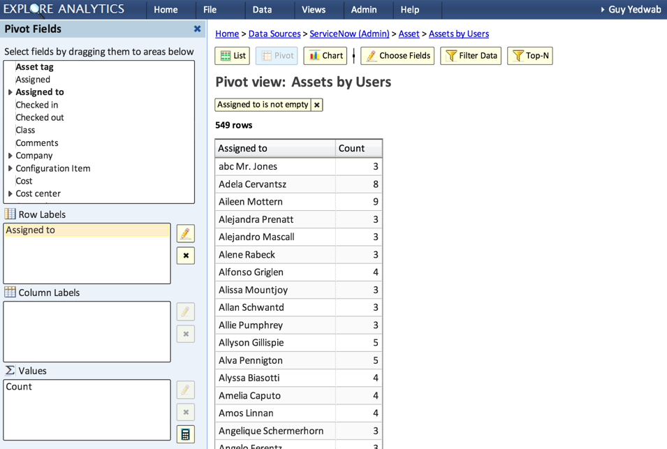
Create a pivot of assets grouped by users
- Create a new view on the Asset table
- Type: Pivot
- Row Labels: Assigned To
- Values: Count (should be auto-generated for you)

- Relabel the “Assigned To” field to “Name”. This will ensure that the “User” in this view matches the “User” in the other view.

Create a pivot of all users
- Create a new view on the User table
- Type: Pivot
- Row Labels: Name
- Remove “Count” from the Values field, we won’t need it

Create a mashup of both views
- Create a new mashup view, with both of the views we just created as an input view

- Sort by Count, smallest to largest.

- Voila! You should have a list, at the top of which are the users with no assets!


